The Unaccountable series
Custom template design
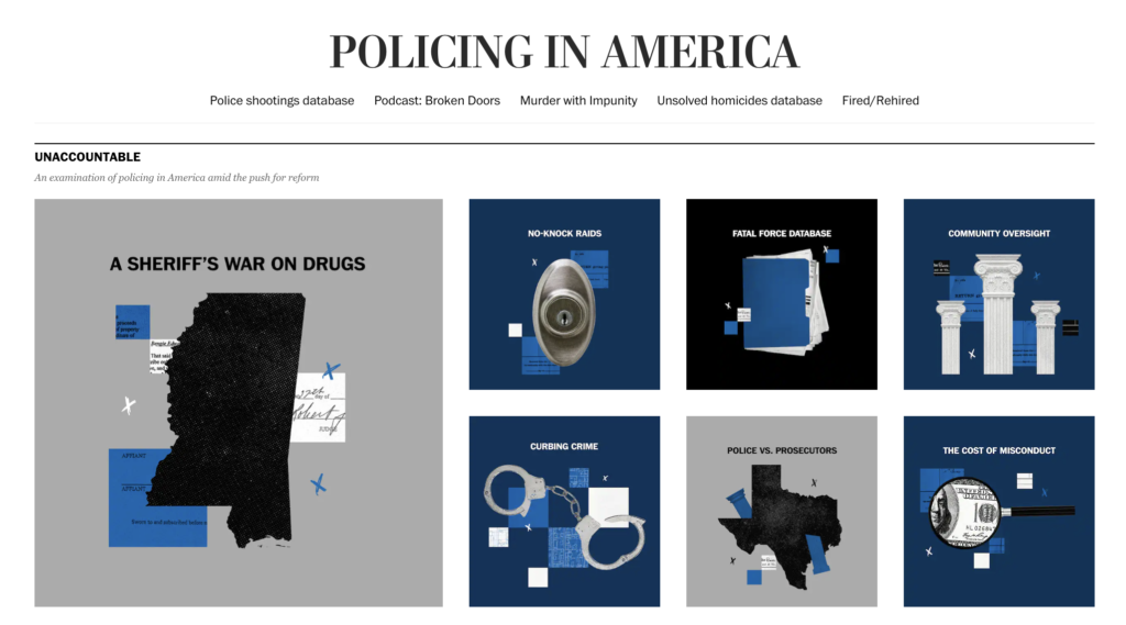
In the months after the deaths of Breonna Taylor and George Floyd, the investigative team got together to do a broad look at cop accountability in the U.S. I was tapped as the lead designer for the resulting series, eventually called Unaccountable. I was tasked with coming up with the branding and toyed around with cop shields, broken blue lines and eventually settled for simplicity: a pop color of blue, used in dividing lines, series labels and graphics. I chose a side-by-side template for more visual impact throughout each story since I knew we would have plenty of handout photos, videos and graphics in addition to photos from our staff and freelancers. At the start of every story’s production cycle, I would meet with the photo editor and comb through the story and a photo outline I created listing each of the people featured. Particularly because this was a series about accountability, we were meticulous in getting as many faces to the names as possible. Nine stories have been published in this series since April 2021. This series is ongoing.
Landing page design and relaunch
When this project began, I really wanted to make a memorable landing page that would house all The Post’s police coverage. Given time constraints, the best I could manage by the launch of the series was a webpage that looked like a bajillion other landing pages found on washingtonpost.com. Eight months after the project started, I hadn’t shaken the original goal and when I had a break between stories, I collaborated with the editors on the series to create a different experience. The Post began targeting what they called “super millennials” or people in their 30s and 40s. I wanted to create a landing page that borrowed a user experience that age group would be familiar with and break down these broad looks at policing into digestible pieces. I partnered with another designer to make collage illustrations on tiled squares set up in a modular format using the blue I had picked from the start of the series and a couple other neutral colors. The result was a clean, intuitive and cohesively branded collection of stories highlighted on a landing page of a whole lot of policing coverage.
Podcast art direction
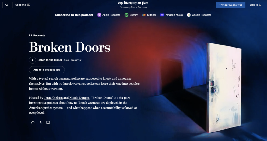
Months into designing this series, two stories still in the works, covering no-knock warrants, were elevated to become an six-episode podcast. There were a few months where I was publishing stories in the series while also coordinating with developers and illustrators to create the branding of this podcast, Broken Doors. I found one illustrator with a good style, but under the pressure of publication, we made a quick decision to move on to an in-house illustrator. While that made it easier to go over edits and iterations, it was tricky to not accept the first ideas that came into our heads, keep the tone appropriate with the color palette and, actually, use doors that were found on the outside of a house and not the inside. In the end, the branding was used on podcast apps across the board, with the online and in-print stories, newspaper ads and even on cookies.
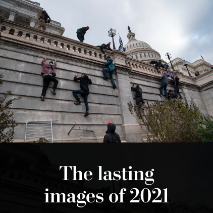
Photos of the year 2021
Digital presentation
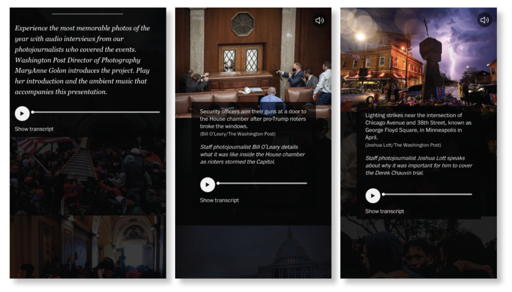
The photo team had an idea to pair audio clips of interviews with photographers and their photos in the traditional year-end presentation. After working with design, the result was a very powerful and unique experience. Many news organizations publish photo collections at the end of the year, but none had the extra layer of hearing from photographers themselves. Seeing photos from news events that shook the world, like the January 6 riot, airstrikes in Gaza and protests around the Derek Chauvin trial in Minneapolis was striking enough. In pairing the images with clips of the photographers speaking on their experiences at these places or getting to know the subjects in the photos, the storytelling came full circle.
Print presentation
In print, I didn’t want to lose the personalization of the photographer’s interviews, so I paired the photos with quotes from them. I designed a 16-page special section that included a wrap cover, a full doubletruck and three faux-trucks to be able to maximize the key photos for print readers.